

What Pocket Square to Wear with a Blue Jacket
Blue is the jacket colour every man already owns, which is exactly why the pocket square gets overlooked. A navy jacket over a white shirt is a blank canvas, and what you put in the breast pocket does more work than almost any other decision in the outfit. Five combinations below show how far that one square of silk or linen can carry a look, and why it deserves rather more thought than the tie sitting next to it.
Shop the Video
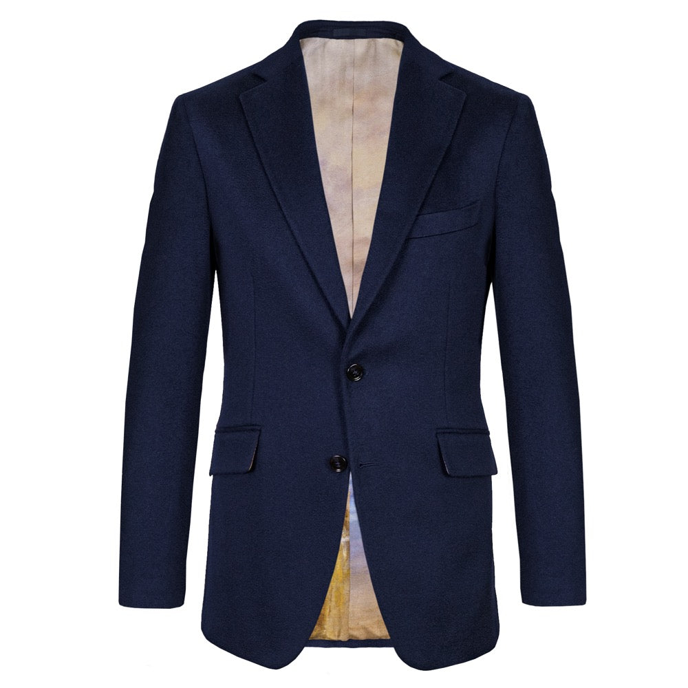 Navy Cashmere Jacket
£2,845
Navy Cashmere Jacket
£2,845
 Crimson Red Wool-Cashmere Tie
£195
Crimson Red Wool-Cashmere Tie
£195
 The Colours, Advance of the Scots Guards at the Alma Pocket Square
£90
The Colours, Advance of the Scots Guards at the Alma Pocket Square
£90
 Navy Shantung Silk Tie
£155
Navy Shantung Silk Tie
£155
 The Cutty Sark Pocket Square
£90
The Cutty Sark Pocket Square
£90
 Navy, Saffron & Cream Stripe Shantung Silk Tie
£155
Navy, Saffron & Cream Stripe Shantung Silk Tie
£155
 Goldfinch by William Lewin Pocket Square
£90
Goldfinch by William Lewin Pocket Square
£90
 Navy & Forest Diamond Silk Twill Tie
£155
Navy & Forest Diamond Silk Twill Tie
£155
 The Palace Guard Pocket Square
£90
The Palace Guard Pocket Square
£90
For more styling tutorials subscribe to our channel
Subscribe to Our ChannelWhat Pocket Square Goes With a Navy Jacket?

Start with the jacket, not the pocket square, because that is the order in which the eye reads an outfit. Navy is the most forgiving background in tailoring: dark enough to carry colour, neutral enough to let almost anything sit against it without a fight. Against a plain white shirt, that navy jacket becomes a blank canvas, and the pocket square is doing more of the outfit's talking than most men give it credit for. A navy jacket rewards a little more thought than that. It isn't fussy. It is quietly showing off whatever you put next to it.
The honest answer is that several categories of pocket square work with blue, and the choice between them has more to do with the occasion than with any fixed rule. A muted, tonal square gives a considered, professional impression. A warm madder silk in burgundy or gold lifts the whole outfit with contrast. A fine art print, pictorial and specific, adds a genuine point of interest. None of these is more correct than the others. They are simply different registers of the same jacket, and the five pairings below show how each one plays out in practice.
The Monochrome Opening
Why a Muted Pocket Square Makes the Most Professional Impression
The first pairing worth learning is also the most restrained: a textured, tonal tie against a similarly muted pocket square, both sitting close enough in colour to read as a single considered decision rather than two separate ones. Paired here with our own Navy Prince of Wales Merino Wool Tie, The Cutty Sark Pocket Square keeps the whole look nearly monochrome, which is precisely the point. To the casual observer the combination looks plain. Look closer and there is a check running through the tie's weave and a texture in the merino wool that gives the eye something to find, while the pocket square echoes the same restrained palette rather than fighting it.
This is the pocket square to reach for when the outfit needs to say nothing louder than the room requires: an interview, a client meeting, any occasion where the goal is to look finished rather than interesting. View from Vaekero near Christiania by Johan Christian Dahl sits comfortably alongside it as a second option in the same restrained register: a hazy, soft-lit landscape rather than an obvious motif, its muted blues and greys reading as texture at a distance rather than pattern. Between the two, you have a genuine choice of muted squares rather than a single default. The lesson generalises well beyond either one. A monochrome or near-monochrome pocket square is never a failure of imagination. It is often the more sophisticated choice, because it depends entirely on texture and tone doing work that colour usually does instead.

Navy and Burgundy
Why Navy and Burgundy Is a Combination You Can Never Get Wrong
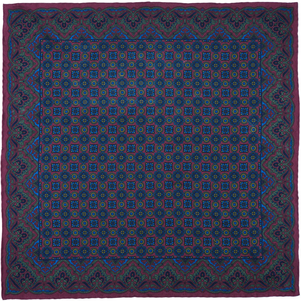
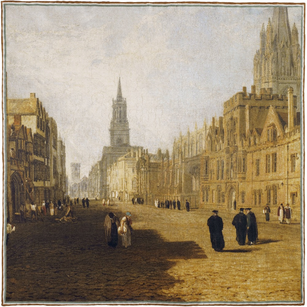
If the first pairing is about restraint, the second is about a colour relationship so reliable it barely needs explaining: navy and burgundy. Here the Crimson Red Wool-Cashmere Tie sits underneath The Colours, Advance of the Scots Guards at the Alma, a pocket square that gives you room to dial the contrast up or down depending on how much of its lighter hues you let show through the fold. This is one of the most classic pairings in tailoring for a reason. Crimson and burgundy sit close enough to navy in depth to feel harmonious, while carrying enough warmth of their own to lift the whole outfit rather than disappear into it.
The wool-cashmere texture of the tie matters here as much as the colour. A flat, glossy silk in the same shade would read as sharper and more corporate. The softness of a cashmere blend brings a little more ease to the pairing, which is why this combination works equally well in the office and at a dinner where the tie is the only formal note in the room.
Plain, Print or Somewhere Between
How to Choose Between a Plain and Patterned Pocket Square
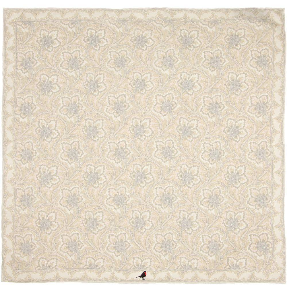
Plain squares are not a beginner's compromise, whatever the internet suggests. A white linen or an ivory wool-cashmere blend against navy is one of the more sophisticated combinations available, precisely because it resists the temptation to compete with the jacket. It works for weddings, for interviews, for any occasion where the goal is to look finished rather than interesting. The texture does the talking: linen has a matte, slightly rumpled quality that reads as considered rather than corporate, while a wool-cashmere blend brings a soft, chalky finish that photographs beautifully against dark cloth.
Patterned squares ask more of the wearer but pay back more too. A fine art silk pocket square, one built from an actual painting rather than an abstract repeat, gives a navy jacket a genuine point of interest that plain squares cannot offer. The trick with pattern is scale rather than colour. A large, busy motif shrunk down to 42 centimetres square can look muddled once folded; a design with clear areas of light and shade survives folding far better, because most folds only reveal a portion of the cloth at any one time.
The middle ground, and the one most people underuse, is the madder silk pocket square. Madder printing produces a distinctive chalky hand and a palette that leans toward burnt orange, mustard, forest green and deep blue: precisely the warm register that works so well against navy. A madder square gives you pattern without the visual weight of a full pictorial scene, which makes it the easiest patterned option to wear repeatedly without anyone noticing you have reached for the same thing twice.
Brown Against Navy
Does Brown Work as a Pocket Square Colour With a Navy Jacket?
Brown and navy is an underused combination, and it deserves more credit than it gets, because the two colours sit at opposite temperatures while sharing a similar depth. The Dark Brown Knitted Wool-Cashmere Blend Tie makes the case well: knitted rather than woven, it brings a matte, textural warmth that a silk tie in the same shade could never quite manage, and it asks for a pocket square with enough contrast to hold its own against it rather than simply repeating the same brown back.
Goldfinch by William Lewin answers that call with white, cream and golden hues that lift cleanly away from the tie's dark ground rather than blending into it, giving the impression of a man who has paid attention to a detail most people miss entirely: that navy and brown, done properly, is one of the more considered pairings in menswear. The knitted texture of the tie and the fine printed silk of the square play off each other nicely too, each doing something the other cannot.

Mixing Patterns Well
Can You Wear a Patterned Pocket Square With a Patterned Jacket?
Yes, and it is one of the more satisfying things to get right, though it does require a rule most people never articulate: only one pattern is allowed to be the largest in the outfit. A navy jacket with a subtle windowpane or birdseye texture still counts as a patterned jacket, even though the pattern reads as texture from a distance rather than an obvious print. Against a jacket like that, a bolder pocket square, a fine art silk or a madder print with real presence, has room to exist without the two patterns colliding.
The reverse is harder to pull off. A jacket with a loud check needs a properly restrained pocket square: plain white, or a single-colour silk with minimal pattern of its own. Two busy patterns in close proximity, jacket and pocket square both competing for attention at chest height, is the single most common way this goes wrong. If in doubt, look at scale rather than colour. A large-scale check jacket wants a small-scale or solid pocket square. A subtly textured jacket can carry a busier square with confidence.
The Bolder Choice
What Pocket Square Works for a More Casual, Social Occasion?
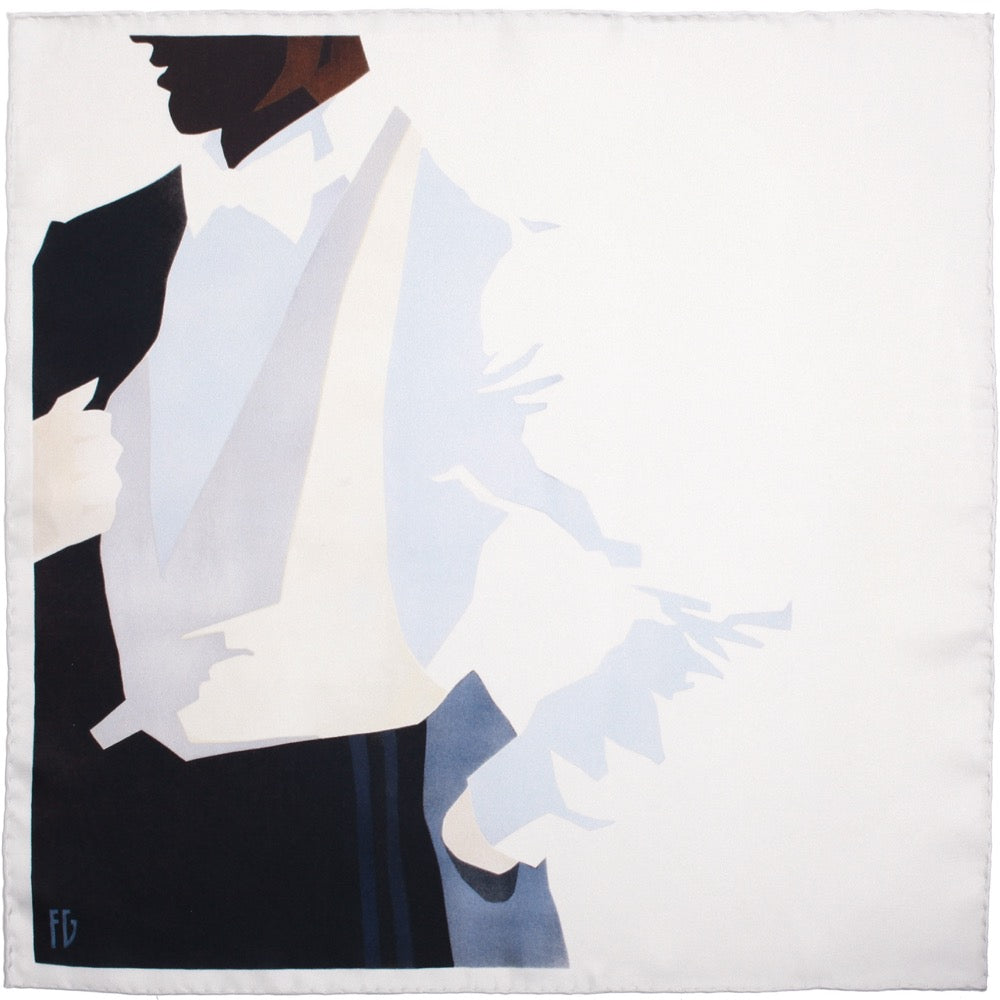
Every rotation needs one combination with a little more nerve, and yellow against navy is the classic way to find it. Paired with the Navy, Saffron & Cream Stripe Shantung Silk Tie, cut in the traditional British direction with the stripe running down from right to left, The Palace Guard Pocket Square brings cream and saffron tones that pop clean away from the navy rather than blending into it. Yellow and gold sit alongside burgundy as one of the two colour families you can pair with navy almost without thinking, and this is the version to reach for once the occasion has relaxed: a wedding in the afternoon, a long lunch, anywhere the outfit is allowed to say a little more than it would in the office.
What makes this combination work is the strength of the contrast rather than any subtlety in the pairing. Where the monochrome opening asked the tie and square to agree with each other, this one asks them to argue a little, and the navy jacket is exactly forgiving enough to referee that argument without losing its own composure.
The Right Fold
How to Fold a Pocket Square for a Blue Jacket

The fold matters more than most people admit, because it decides how much of the pattern actually shows. A puff fold, simply pinching the centre and letting the edges fall loosely, is the most forgiving choice for a busy fine art silk square, since it reveals fragments of colour rather than the whole composition, which almost always looks better at pocket scale than a flat, fully visible scene.
A straight fold, known to some as the presidential fold, suits plain squares best: white linen, ivory wool-cashmere, anything without a print to lose. It reads as formal and restrained, which is exactly the register a plain square is usually chosen for in the first place. A patterned madder silk sits comfortably between these two, since a three-point or one-point fold shows enough of the print to register the pattern without overwhelming the breast pocket.
Whichever fold you choose, resist the instinct to press it flat. A pocket square with a little natural volume looks considered. One that has been ironed into submission looks like it came pre-folded from a shop display, which, in a great many cases, it did.
Where People Go Wrong
Common Mistakes to Avoid When Choosing a Pocket Square For Blue

The most common error is matching the pocket square to the tie stitch for stitch. This was a rule several decades ago and it has aged badly. A tie and pocket square cut from the same cloth reads as a boxed gift set rather than a considered outfit, largely because that is often exactly what it is. Complement the tie instead, the way each of the five combinations above does: pick out a secondary colour from it, or introduce a texture the tie does not have, rather than reaching for its twin.
The second mistake is choosing by season rather than by outfit. Pastels are not automatically a spring rule and jewel tones are not automatically for winter. A burgundy madder square works in July as well as January against a lightweight navy jacket; what changes with the season is the jacket's fabric, not the logic behind the pocket square sitting on top of it.
The third, and perhaps the most avoidable, is buying a pocket square that is simply too small. Anything under 40 centimetres square struggles to hold a fold and tends to sink into the pocket after an hour of movement. It is worth checking dimensions before buying, particularly with linen and wool squares, which are cut slightly smaller than silk as a rule and need every centimetre they can get.
The Case for Keeping More Than One Blue-Ready Square
A navy jacket earns its keep by turning up to more occasions than almost anything else in a wardrobe, which is precisely why a single pocket square will never quite cover it. A wedding wants something with a bit of colour and story behind it. A work meeting wants restraint. A weekend lunch can carry something bolder than either. The five combinations above are a starting rotation rather than a fixed menu: an Ivory Wool-Cashmere Blend square for the quietest days, a madder silk for everyday wear, and a fine art print for the occasions worth remembering. Ring the changes on the tie too. A Navy Shantung Silk Tie or a Navy & Forest Diamond Silk Twill Tie both give the jacket a different mood again, without ever asking the pocket square to compete with anything it wasn't built to compete with. The jacket was never the problem to begin with. It was always waiting for the right thing to sit next to it.
Frequently Asked Questions
Your Questions Answered
What pocket square goes best with a navy blue jacket?
A plain white linen or ivory wool-cashmere square is the safest and most versatile choice. For more character, a warm-toned madder silk in burgundy, rust or forest green gives navy the kind of contrast that makes an outfit look deliberate rather than default.
Should a pocket square match the tie?
No. Matching sets read as a packaged gift rather than a considered outfit. Complement the tie instead, picking out a secondary colour or introducing a texture the tie does not already have, the way a burgundy tie pairs with a lighter-hued pocket square rather than an identical one.
Is burgundy or gold the better pocket square colour for a navy jacket?
Both are classic, reliable choices, and the decision comes down to occasion rather than correctness. Burgundy reads as harmonious and works well for formal or professional settings, while saffron and gold give a bolder, more sociable contrast better suited to relaxed occasions.
Can you wear a patterned pocket square with a checked navy jacket?
Only if the check is subtle. Only one pattern in an outfit should carry real visual weight, so a bold check jacket calls for a plain or minimally patterned square, while a jacket with subtle texture can carry a bolder pocket square with confidence.
Does brown work as a pocket square colour against navy?
Yes, and it is one of the more underused pairings in menswear. Brown and navy sit at opposite temperatures while sharing a similar depth, so a pocket square built around browns, golds and creams gives a navy jacket genuine contrast without ever looking mismatched.
What is the best fold for a patterned pocket square?
A puff fold suits busy, pictorial squares best, since it reveals fragments of the design rather than the whole scene. A one-point or three-point fold works well for madder silks, showing enough pattern to register without overwhelming the pocket.
Does the pocket square need to change with the seasons?
Not by a fixed rule. Jewel tones and darker madder silks work year-round against a navy jacket. What actually changes with the season is the jacket's own fabric weight, cotton and linen in summer, wool and cashmere in winter, rather than the logic behind the pocket square.
How many pocket squares does a navy jacket actually need?
Three or four is a sensible working rotation: one plain or muted square for formal occasions, one madder or burgundy silk for everyday wear, and one bolder fine art or gold-toned print for weddings, dinners, or anywhere the outfit is allowed to say a little more.
To view the full collection click on the button below.