

5 Limited Edition Silk Ties: A Private Label Styling Guide
Five new ties. Ten looks. All of them reserved for Private Label. Chris Modoo takes each design through a relaxed jacket look and a business alternative, from a burgundy square repeat to a teal medallion that might be the most versatile tie in the drop.
Enter our prize draw to win four style guides and £500 to spend
Shop the Video
 Burgundy & Pale-Blue Square Repeat Silk Tie
£195
Burgundy & Pale-Blue Square Repeat Silk Tie
£195
 Navy & Gold Octagon Repeat Madder Silk Tie
£195
Navy & Gold Octagon Repeat Madder Silk Tie
£195
 Navy & Burgundy Cross Medallion Madder Silk Tie
£195
Navy & Burgundy Cross Medallion Madder Silk Tie
£195
 Burgundy & Navy Diamond Repeat Silk Tie
£195
Burgundy & Navy Diamond Repeat Silk Tie
£195
 Teal & Cornflower Medallion Madder Silk Tie
£195
Teal & Cornflower Medallion Madder Silk Tie
£195
 Grey Shantung Silk Tie, Long & Wide
£175
Grey Shantung Silk Tie, Long & Wide
£175
 Balmoral, Navy Pocket Square
£95
Balmoral, Navy Pocket Square
£95
 Light-Grey Hopsack Wool Blend Jacket
£1,445
Light-Grey Hopsack Wool Blend Jacket
£1,445
 Steel Blue & Green Madder Silk Pocket Square
£95
Steel Blue & Green Madder Silk Pocket Square
£95
 Chestnut-Brown Hopsack Wool Blend Jacket
£1,445
Chestnut-Brown Hopsack Wool Blend Jacket
£1,445
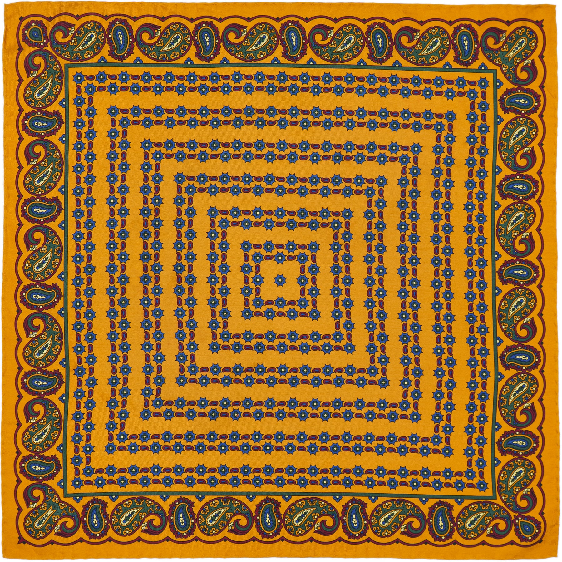 Gold & Navy Paisley Madder Silk Pocket Square
£95
Gold & Navy Paisley Madder Silk Pocket Square
£95
 Balmoral, Paprika Pocket Square
£95
Balmoral, Paprika Pocket Square
£95
 Navy & Sky-Blue Wispy Spot Pocket Square
£95
Navy & Sky-Blue Wispy Spot Pocket Square
£95
 Starry Night by Van Gogh Pocket Square
£95
Starry Night by Van Gogh Pocket Square
£95
 Racing-Green Hopsack Wool Jacket
£1,195
Racing-Green Hopsack Wool Jacket
£1,195
 Navy & Ivory Pin Dot Pocket Square
£95
Navy & Ivory Pin Dot Pocket Square
£95
 Burnt Orange, Green & Navy Madder Silk Pocket Square
£95
Burnt Orange, Green & Navy Madder Silk Pocket Square
£95
 Navy Superfine Merino Wool Jacket
£1,195
Navy Superfine Merino Wool Jacket
£1,195
 The Fighting Temeraire Pocket Square
£95
The Fighting Temeraire Pocket Square
£95
 Navy Extra-Fine Merino Wool Polo Shirt
£260
Navy Extra-Fine Merino Wool Polo Shirt
£260
 Rust & Teal Paisley Pocket Square
£95
Rust & Teal Paisley Pocket Square
£95
 Rust & Blue Paisley Madder Silk Pocket Square
£110
Rust & Blue Paisley Madder Silk Pocket Square
£110
 Midnight Windowpane Wool Jacket
£1,445
Midnight Windowpane Wool Jacket
£1,445
For more styling tutorials subscribe to our channel
Subscribe to Our ChannelBehind the launch
Why These Five Ties Are Reserved for Private Label Members
Five new silk ties join the collection this season, and none of them will appear on the general ties page, now or later. They sit permanently inside Private Label, made only for members and never released more widely. Each one is made in limited numbers, which means the run is a fixed quantity rather than a marketing description of one.
Private Label membership is by request rather than automatic. If you are already signed up to our general mailing list, that gets you our styling guides and the odd invitation, but it does not put you inside Private Label itself. Members get pieces made only for them, early sight of new collections, a concierge who already knows what is already hanging in their wardrobe, and a say in what gets made next. If any of that sounds like your kind of thing, you can join the waiting list and we will be in touch.
What follows is a guide to all five designs and the two ways Chris Modoo styled each one on camera, from an odd jacket look for the weekend through to a full business alternative. Consider it a preview of what membership actually gets you, rather than a review of five ties you can order this afternoon.
The basics
How to Match a Silk Tie and Pocket Square
The question we are asked more than any other, by a distance, is how to put a tie and a pocket square together without it looking like they were bought as a set. The rule that solves most of it: do not repeat the tie's main colour in the pocket square. Instead, find the secondary colour buried in the tie's pattern, the one doing less of the work, and let that become the pocket square's headline colour instead.
Take a dark red tie with a small blue repeat pattern running through it. The obvious move is a red pocket square. The better move is a blue one, ideally in a completely different scale of pattern, so the tie reads as fine detail and the pocket square reads as texture. You end up with two things that clearly belong to the same outfit without appearing to have been purchased in the same transaction. It is close to a formula, and it is one of the most reliable ways to look considered without spending any real time on it. Our longer guide to matching a pocket square and tie runs through the full set of rules if you want the detail behind this one.
The same logic runs the other way for pattern-shy dressers. If you would rather not commit to two patterns at once, find a tie and pocket square where the colours are close to reversed: the tie's background becomes the square's accent, and vice versa. It reads as a matching pair without being one, and it is about as safe as tie and pocket square pairing gets. Once you are past that stage, the five ties every wardrobe needs guide is worth a read for building the collection this drop will slot into.
The cloth itself
What Makes Madder Silk Different From a Printed Twill
Three of the five new ties are madder silk, and it is worth knowing what that means before you get to the styling. Madder silk is screen-printed rather than woven, using a technique that produces a slightly chalky, matte finish rather than the high sheen you get from a twill weave. The colour sits differently in the cloth as a result. It looks less like paint sitting on top of silk and more like the silk itself has been dyed through, which gives madder ties a softer, more lived-in appearance even brand new.
It also handles differently. Madder silk has a dry, dusty texture under the fingers rather than the slippery cool of a twill, and it drapes with a little more structure as a result. That makes it equally happy under a soft sports jacket or a full business suit, which is part of why it turns up so often in this kind of styling video. A twill tie can look slightly too polished against tweed or hopsack. Madder silk never does.
Our printers work from Macclesfield, a town with a genuine claim to the history of English silk printing, and every madder design in this collection goes through the same process: a base fabric, layer after layer of colour built up by hand-cut screens, and a finish that ages well rather than simply wearing out. If you want the longer version of how the technique developed, the history of madder silk covers where it came from and why the colour spectrum runs so much further than the traditional reds and oranges people associate with it.
The new designs
Five Limited Edition Ties and How to Style Each One
Here is the full set, in the order Chris takes you through them on camera, with the two looks built around each design.
The Burgundy & Pale-Blue Square Repeat Tie: A Tie for Transitional Weather
This is the tie that opens the video, and it earns that place. A dark red printed silk carries a small, tightly repeated cornflower blue square and dot pattern across it, clean enough to read as texture from across a room and sharp enough to reward a closer look. It is the ideal candidate for the pocket square principle above: rather than reaching for another red, pull the cornflower blue out and let it lead the pocket square instead.
Styled with a lightweight jacket, an off-white shirt and a small, neat tie knot, this look is built for the weeks either side of summer, when London stays warmer for longer than the calendar suggests but a full summer outfit still feels wrong. The pocket square pulls the cornflower blue straight out of the tie in a steel blue and green madder silk, exactly as the matching principle above suggests. Add mid-grey flannel trousers, which work with almost anything in this drop, and a pair of suede shoes in a colour that leans warm rather than grey.

The tie reappears later in the video under a dark grey jacket, worn this time with a navy and ivory pin dot pocket square that keeps the whole pairing considerably quieter. The pattern is restrained enough to sit comfortably under a plainer jacket than the one above, which is worth knowing if grey is already the colour doing most of the work in your wardrobe.

The Navy & Gold Octagon Tie: Pairing Madder Silk With a Chestnut Jacket
The first of the three madder silk ties in the drop, and the one that shows off the finish best. Navy forms the ground, with a repeating octagon and gold detail worked through it, and that dusty, matte quality of madder silk is immediately obvious against skin and cloth alike. It works equally well against a sports jacket as it does a full business suit, which is not a small claim for a single tie to make.
Styled here with a chestnut wool sports jacket and a washed chambray shirt, the pairing leans on a simple rule: look for the smallest colour in the tie's pattern and let it lead the jacket. Here that is the gold, picked up and expanded into the jacket's tone. A mustard pocket square with a small gold spot completes it, working almost as a reversed echo of the tie itself rather than a direct match. This is a forgiving combination for anyone still finding their feet with pattern mixing, since the palette stays tight even as the textures multiply.

Later in the video the same tie reappears under a navy superfine merino wool jacket, a noticeably smarter cloth than the chestnut hopsack above, paired this time with a burnt orange, green and navy madder silk pocket square that pulls the same gold and orange tones through in a different key. Where the chestnut jacket leans casual, this pairing takes the tie into business territory without changing a single thing about the tie itself, which is really the point of a good madder silk design. It should not need to work harder in one context than another.

The Navy & Burgundy Cross Medallion Tie: Why a Busy Pattern Can Read as Plain
Look closely and this is an intricate design, a cross motif worked in navy and burgundy across the full length of the tie. Look at it from any normal conversational distance, though, and it reads simply as a textured plain navy. That distinction matters more than it sounds. A tie that is detailed up close but calm from a distance gives you the option to wear a considerably stronger trouser than a truly bold pattern would allow, since the tie itself is doing less visual work than it appears to.
Chris styles this one against a double-breasted jacket in a light camel hair, with a white shirt chosen specifically to let the cross motif pop rather than recede. Because so little of the tie is actually visible under a double-breasted cut, he pushes the rest of the outfit further than he otherwise might, suggesting a brown and cream Prince of Wales check trouser in wool flannel or a lightweight tweed, finished with dark brown brogues. It is a lesson in reading how much of a pattern will actually be seen before deciding how bold to go elsewhere.

The second outing for this tie swaps the camel double-breasted jacket for a grey sports jacket, worn with The Fighting Temeraire pocket square, a design lifted from Turner's painting of the same name. Our navy extra-fine merino wool polo shirt is knotted over the shoulders rather than worn as a shirt, the same trick used elsewhere in the video with a sweater, and it softens what would otherwise read as a fairly formal combination.

The Burgundy & Navy Diamond Tie: A Bolder Choice for Business Dress
Where the cross medallion tie hides its detail, this one puts it forward. A diamond repeat pattern in burgundy and navy gives it more visible presence at a distance, which makes it the boldest of the five and the one best suited to a striped shirt rather than a plain one. Styled here with a bolder striped shirt and a clean, uncomplicated pocket square in a simple two-tone blue with a larger spot, the whole look stays inside the boundaries of conservative business dress while still being noticeably more playful than the standard blue-suit-white-shirt formula.
That distinction, between playful and inappropriate, comes down almost entirely to restraint elsewhere in the outfit. Pair a tie this present with a plain, unpatterned suit, ideally a charcoal, and finish with classic black oxfords rather than anything more casual. The tie is the entire statement. Everything else should agree with it rather than compete.

For its second outing, the diamond repeat tie is paired with a rust and teal paisley pocket square instead, trading the cool navy and sky blue combination above for something with noticeably more warmth. It is a useful reminder that one bold tie can sit at either end of a colour temperature depending on what you put with it, without ever reading as a different tie.

The Teal & Cornflower Medallion Tie: The Most Versatile of the Five
The last design is also the one that works hardest across the video. A teal ground carries a soft medallion pattern with flecks of green and yellow running through it, and Chris uses it to demonstrate everything a single tie can cover, from an odd jacket look to a full business suit, without ever feeling like two different ties.
The first version pairs it with a green basket weave jacket and a mustard waistcoat, a genuine piece of high-low dressing that pulls the tiny hits of green and yellow out of the pattern and expands them across the rest of the outfit. The Starry Night pocket square, adapted from Van Gogh's painting, adds a third texture without adding a third colour that fights for attention. Keep the bottom half quiet when the top half is doing this much work: mid-grey flannel trousers and brown suede loafers are the natural choice.

The second version dresses the same tie down into something closer to office wear, worn under a midnight windowpane wool jacket with a rust and blue paisley madder silk pocket square, its petrol-blue border picking up a thread from the tie itself, and finished with dark burgundy loafers. It is proof that a strong pattern in a tie does not have to mean a loud outfit built around it.

Mixing patterns
How to Wear a Bold Tie With a Patterned Jacket or Waistcoat
Most tie and jacket advice defaults to the safe answer: keep one pattern loud and everything else plain. It is good advice, and most of the pairings above follow it. But the odd jacket look on the teal tie above is worth pulling apart on its own, because it breaks that rule deliberately and still works.
The trick is scale rather than restraint. A basket weave jacket, a medallion tie and a waistcoat in a contrasting colour can coexist because each pattern operates at a completely different size: the jacket's texture reads as a surface rather than a print, the tie's medallions sit at a middle scale, and the waistcoat becomes a single block of colour rather than a pattern of its own. None of them are competing for the same visual space, which is the real rule hiding underneath "keep it simple." You are not avoiding pattern. You are avoiding three patterns operating at the same scale in the same place.
The other detail worth borrowing from this look is sock colour. Rather than matching socks to shoes or trousers, which is the instinct most men default to, pull a colour directly from the tie or pocket square instead and let the sock carry it down to the ankle. Nobody clocks it consciously. It just reads as put together, in a way that is hard to reverse-engineer unless you already know the trick. Save it for days when you actually have time to dress, since it works precisely because it looks unhurried.
Off duty
How to Dress Down a Business Suit With a Silk Tie
The most useful question this drop answers is not how to dress up. It is how to dress a formal suit down without looking like you left the office in a hurry. Take the most conservative suit you own, a two-button mid-grey worsted, and keep the tie exactly as it is: a madder silk in a considered pattern, worn properly, not loosened. Everything else moves.
Swap the plain white or blue business shirt for a chambray check, add a sweater over the shoulders rather than under the jacket, and change the footwear entirely. This is where the choice matters most. Sneakers with a suit rarely earn their place. A crepe-soled chukka boot does the same job of looking relaxed while still reading as considered rather than careless, in the tradition of the sort of boot Steve McQueen wore with tailoring for decades before anyone called it a trend.
The tie and the suit stay smart. The shirt, the shoulders and the shoes go casual. That contrast, rather than any single item, is what makes the whole outfit read as someone who enjoys their clothes rather than someone following a dress code. It also means one good suit and one strong tie can cover both a formal Tuesday and a casual Saturday, which is a better return on a single purchase than most of what a wardrobe holds. The same trick works with any of the five ties above. Start with the tie you would reach for on a normal working day, then take away one formal signal at a time, shirt first, then shoulders, then shoes, and stop as soon as the balance feels right for where you are actually going.
Frequently Asked Questions
Your Questions Answered
What is Rampley & Co Private Label and how do I get access to it?
Private Label is our membership tier, sitting above the general newsletter, for pieces made only for members and never released more widely. Membership is by request rather than automatic sign-up: non-members can join the waiting list from the Private Label collection, and applications are reviewed personally by our concierge team.
How do you match a tie and a pocket square without them looking too matched?
Avoid repeating the tie's main colour in the pocket square. Instead, find the smaller, secondary colour in the tie's pattern and build the pocket square around that instead, ideally in a different scale of pattern. This gives you two pieces that clearly belong together without reading as a boxed set.
What is madder silk and how is it different from a printed twill tie?
Madder silk is screen-printed rather than woven, which gives it a soft, slightly chalky finish rather than the high sheen of a twill weave. It has a dry, dusty handle and drapes with a little more structure, which is why it suits both sports jackets and full business suits equally well.
Can you wear a patterned tie with a patterned jacket?
Yes, provided the patterns sit at different scales. A textured jacket weave, a medium-scale tie pattern and a block colour waistcoat or shirt can coexist because none of them compete for the same visual space. The rule to avoid is three patterns at the same scale in the same outfit, not pattern mixing itself.
How can I dress down a business suit for the weekend?
Keep the suit and tie exactly as worn for the office, then change everything around them: swap a plain shirt for a checked chambray, add a sweater over the shoulders, and replace formal shoes with a crepe-soled chukka boot. The contrast between a smart tie and a relaxed shirt and shoe is what reads as considered rather than careless.
These five ties are reserved for Private Label. Join the waiting list to be considered for the next release.