

The Complete Guide to Men’s Colour, Pattern and Texture Matching
There is an old piece of received wisdom that a matching tie and pocket square is bad form, and like most received wisdom it is worth interrogating rather than simply repeating. In this video we put a matched look next to a contrasting one and worked out, honestly, which one actually earns its place in a considered wardrobe, and why.
Shop the Video
For more styling tutorials, subscribe to our channel
Subscribe to Our ChannelMatching Versus Contrasting
Should a Tie and Pocket Square Match or Contrast?
The conventional answer is contrast, and most of the time the conventional answer is right. A tie and pocket square cut from the same cloth in the same colour can read as a boxed set rather than an outfit, as though the two items arrived together in cellophane and were never meant to be considered separately. It is the look of something bought rather than put together, and it tends to sit slightly uneasily even on a well-cut suit and well-polished shoes.
And yet it is worth admitting, once you actually look at a matched pairing rather than dismissing it on principle, that it is not automatically a disaster. A navy tie and a navy pocket square with a bit of shape or texture to the fold can avoid the flatness that makes matching look artificial in the first place. The eye forgives repetition of colour more easily than it forgives repetition of pattern, and a pocket square that catches the light differently to the tie beside it has already done half the work of looking deliberate.
Contrast, done properly, is still the more sophisticated route, and it works on more than one level at once. A silk twill pocket square against a shantung tie gives you two different colours, two different patterns and two different textures in one glance, which is a great deal more to look at than a single matched tone. The trick that lifts a contrasting pairing from merely different to genuinely harmonious is a quiet echo somewhere else in the outfit: a thread of sky blue in the pocket square picked up by a sky blue shirt, or a touch of gold in the square meeting a cream or pale yellow collar. The tie and square are not trying to match each other. They are both, separately, in conversation with the shirt.
That is really the heart of the matter. A matched tie and pocket square asks two accessories to agree with one another. A well-built contrast asks them to each agree with the rest of the outfit instead, which is a more interesting problem to solve and, more often than not, a better-looking solution.

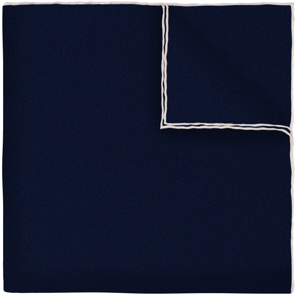
This is a good pairing to study for exactly this reason. Both pieces sit in the same navy family, close enough that a careless eye might call it matching, but the shantung's nubby weave against the pocket square's contrast-trimmed silk keeps the two from ever reading as a set. The ecru trim does the harmonising work that a shirt collar might otherwise be asked to do.
The System Underneath
How to Match Colours in Menswear Tailoring

London in winter has a way of making colour feel like a foreign language. Nine months of the year the city dresses in navy and charcoal and dark overcoats, and there is a reasonable argument for all of it. Refinement, discretion, functionality: tailoring built these virtues into its own colour palette a long time ago, and most of the time it is right to leave well alone. But colour is not something to be feared, and the men who wear it well are not taking a risk so much as following a system that the rest of the room has simply never bothered to learn.
The system has three parts, and once you see them you cannot unsee them. Base colours sit at the bottom: the jacket and the trousers. A lighter tone sits above that: the shirt or the knitwear. And the accent sits on top, doing the interesting work through the tie, the pocket square, or a cravat if you are feeling ambitious. Darker below, lighter above, brighter on top. It sounds almost too simple to be useful, and yet it is the reason a well-dressed man's outfit reads as considered rather than accidental.
Base colours themselves are the reliable, load-bearing tones: browns, navy, beige, cream, charcoal, silver. They work in almost any combination, separately or together, which is precisely why they are trusted with the big-ticket garments. The tie and pocket square are where you get to have an opinion. Keep that hierarchy in mind and colour stops being a hazard and starts being a tool.
Reading Your Own Colouring
How to Choose Colours That Suit Your Skin Tone

Before any of the pairing rules matter, there is a quieter question worth answering honestly: which colours actually suit you. This has nothing to do with fashion and everything to do with contrast. Darker and richer skin tones tend to carry forest greens, deep yellows and mustards, and burgundy with real conviction, while very pale browns, certain pinks and beige can wash the same complexion out entirely. Fairer skin tends to work the other way, often needing a touch more warmth or depth to avoid looking flat next to a pale shirt.
None of this means avoiding a colour altogether. It means introducing it carefully, and often through an accessory rather than a jacket, until you know how it behaves against your own colouring. A tie or pocket square is a low-stakes place to experiment. A suit is not. Get the reading right on the small items first and the bigger purchases become far easier to judge.
Ties and Pocket Squares
How to Pair a Tie and Pocket Square With Colour in Mind

A dark brown suit, a cream shirt rather than stark white, brown boots, a dark repp tie, and a pocket square that gathers up the whole palette in miniature: that combination works because every element is doing a specific job, and none of them is fighting for attention at the same time. The cream shirt matters more than it looks. White against dark brown often reads as too sharp a jump in contrast; cream softens the transition and lets the suit stay the focal point.
The inverse works just as well. A beige jacket, a classic white poplin shirt, a dark knitted tie in olive or similar, and a pocket square that complements rather than repeats. White sits comfortably here because beige and white are close enough on the spectrum that the contrast never becomes a competition. The lesson in both cases is the same: decide which garment is meant to hold the eye, and dress everything else in service of it.
Colour-matching a shirt and pocket square to an identical shade is the one manoeuvre that separates the confident from the overdone, and it only works under specific conditions. It needs a difference in texture or pattern to stop the whole look feeling flat: a discreetly striped shirt against a solid tie, for instance, or a silk with a visible weave rather than a plain print. Match colour without addressing pattern or texture and the outfit starts to look like a costume rather than a considered choice.
Building the Habit
How to Introduce Pattern Without Overdoing It

Pattern behaves by the same logic as colour, and the same warning applies twice as hard: it is very easy to overdo. Identical patterns worn together are the fastest way to look as though you got dressed in the dark. The safer, and frankly more interesting, approach is to think in terms of three garments, the jacket, the shirt and the tie, and commit pattern to two of the three, making sure those two patterns are visibly different from one another.
Run through the combinations and you will find there are more than enough to keep you interested for years: a houndstooth jacket with a solid shirt and a striped tie, a chalkstripe jacket with a solid shirt and a spotted tie, a solid jacket with a striped shirt and a spotted tie. The scale of the pattern matters as much as its presence. Stripes and spots read as smarter the narrower and softer they are, and bolder the wider and more casual the setting. A butcher stripe or a large polka dot belongs at the weekend, not in a boardroom, however much you might want to make the case otherwise.
If a bolder pattern is non-negotiable, the compromise is to keep everything around it as quiet as possible. One statement pattern, surrounded by solids, still reads as deliberate. Two statement patterns in the same outfit reads as an accident.
Jackets and Full Suits
How to Wear Patterned Jackets and Suits Correctly

A patterned suit carries its pattern onto the trouser as well as the jacket, which changes the maths considerably. Where a sports jacket can afford a bolder check or stripe, a suit needs restraint: a subtle stripe or herringbone in an off-colour, charcoal rather than black, navy rather than royal blue, will do considerably more for you than anything shouting for attention across a room.
Checked cloth suits a wider windowpane reasonably well provided the colours stay muted, but for smaller checks, houndstooth and puppytooth, it usually pays to break things up with a solid trouser rather than doubling down on pattern. This is one of the few places where the rule is simple: the busier weaves are best kept to jacketing cloth, worn as separates, and never asked to do double duty as a full suit.
Which brings us to a distinction that is worth making explicit, because it is the single most common mistake in this territory: a suit jacket is not a sports jacket. It was cut and cloth-matched to be worn with its own trousers, and asking it to do the work of a separate, casual jacket, especially over jeans with a pair of pointed black shoes, undoes whatever sartorial credit you had built up to that point. If you want a jacket that lives happily on its own, buy one designed for that purpose. Our tailored jackets collection is built entirely around cloths with enough texture and character to work as standalone pieces.
The Third Ingredient
Why Texture Matters as Much as Colour and Pattern
If colour and pattern are something close to a science, texture is closer to an art, and it is the ingredient most men reach for last, which is a shame, because it is the one that opens up the largest wardrobe. English flannel, Italian silk, Egyptian cotton, Cuban seersucker, shantung, cashmere, tweed: each carries its own weight, drape and handfeel, and each changes how a colour reads once it is woven into a particular cloth.
A good sports jacket earns its keep through texture as much as through colour or check. Brown, in particular, comes alive against pattern and texture in a way that flat navy rarely needs to. A brown houndstooth jacket paired with a pale blue Oxford button-down and a grey herringbone tie works because every layer contributes a different texture: the rough weave of the houndstooth, the soft cotton weave of the shirt, the woven texture of the tie. Colour alone could not do that work. Texture is what keeps four different patterns in one outfit from feeling excessive rather than accomplished.
The simplest way to bring texture into an outfit without overhauling the wardrobe is through the accessory: swap a printed silk tie for a shantung or a knitted silk, or a plain pocket square for a hand-rolled cotton one. A navy suit, white shirt and striped silk tie is a perfectly good outfit. The same combination with a shantung silk tie in place of the printed one is a noticeably better one, and the only thing that changed was the weave.
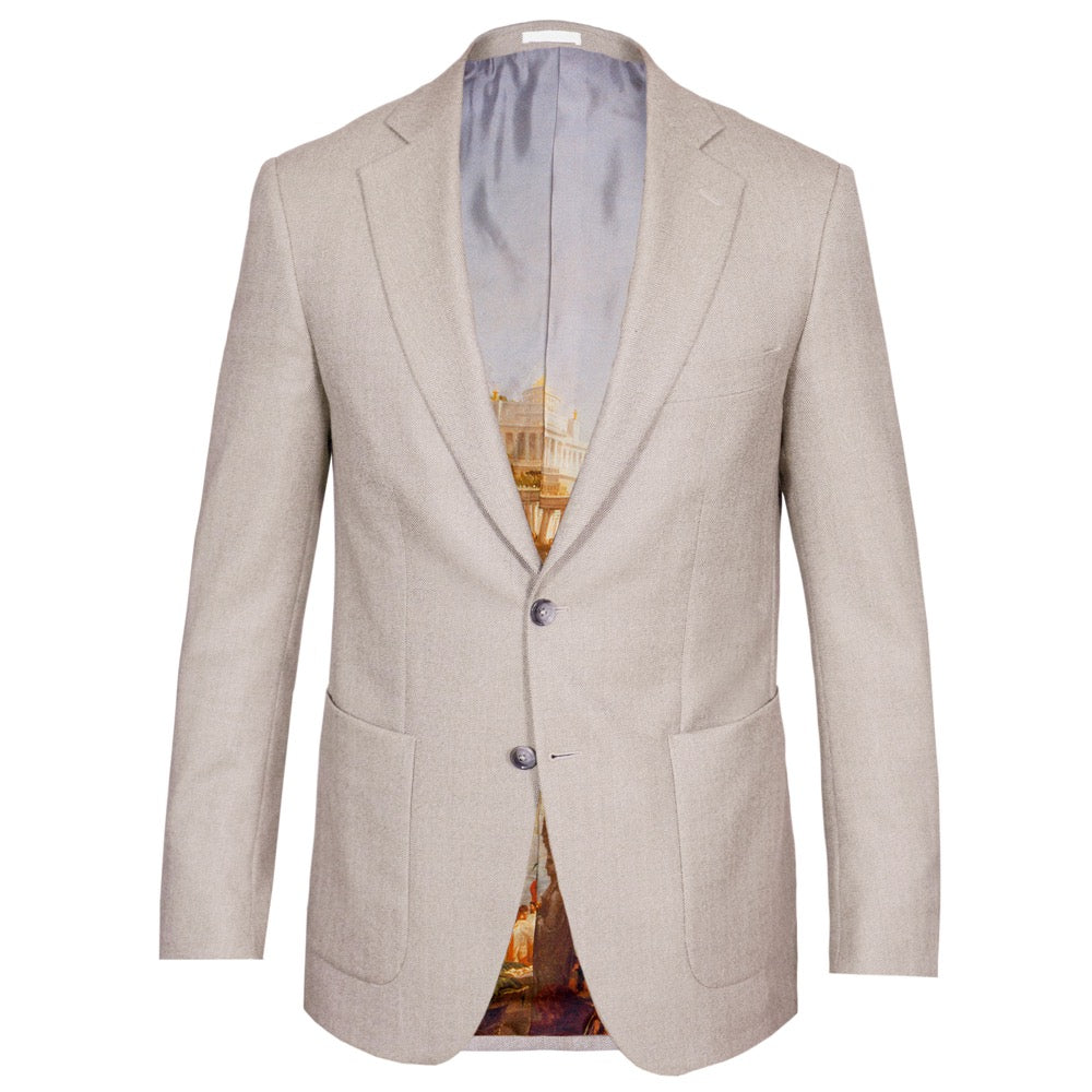

The herringbone weave is doing most of the work here. On its own a biscuit jacket in a flat weave would need help from the accessories to feel considered. In herringbone, the texture is already load-bearing, which frees a plain midnight tie to sit quietly underneath it rather than compete for the eye's attention.
Colder Months, Rougher Cloth
How to Use Tweed and Textured Cloth in Autumn and Winter Dressing
Overcoats and heavier jackets are where texture gets to show off properly, and tweed is the obvious place to start. It is a rough, heavyweight wool with an open weave, usually built as a twill or a herringbone, and it is designed to survive weather that would defeat a lighter cloth. The finest examples still come from the United Kingdom, Harris Tweed most famously, woven on the Isle of Harris in the Outer Hebrides and originally built for high seas, shooting and long days outdoors rather than city pavements.
Tweed has since made the move into more casual town wear without losing its character, and the lighter weights tend to be the most versatile for that purpose. Because a tweed is typically flecked with several colours in its weave rather than a single flat tone, it hands you a ready-made palette of accent colours to pull a tie or pocket square from, which makes building an outfit around it considerably easier than it looks.
The same logic extends to more casual outerwear: waxed jackets, peacoats, and the heavier field jacket family all lean on texture to do work that colour alone cannot. A waxed jacket over a heavy cable knit, worn with selvedge denim and a pair of leather boots, reads as considered rather than merely practical, precisely because the textures are doing the talking.
Putting It Together
How to Combine Colour, Pattern and Texture With Confidence
None of this resolves itself in an afternoon. It takes years of paying attention, trying combinations that do not quite work, and slowly building an instinct for when the rules can be bent. Once that instinct is in place, the three ingredients, colour, pattern and texture, stop being separate decisions and start operating together, almost without conscious thought.
Until then, the system holds up on its own: base colours below, a lighter tone above, an accent on top. Pattern on two of three garments, never all three. Texture wherever colour or pattern needs a reason to feel more than accidental. It is not a set of restrictions so much as a set of load-bearing walls. Once they are in place, you can decorate however you like.


A neutral like light grey is exactly where the system proves itself. The jacket does nothing to draw the eye, which means the pocket square is free to do all of it: the blues and creams of the Sorolla painting sit against the grey the way an accent is meant to, without a single other decision required to make the outfit work.
Frequently Asked Questions
Your Questions Answered
What are base colours in menswear tailoring?
Base colours are the reliable, classic tones that work in almost any combination: browns, navy, beige, cream, charcoal and silver. They are reserved for the big-ticket items, the jacket and trousers, while lighter tones and brighter accents are layered on top through the shirt, tie and pocket square.
How do I know which colours suit my skin tone?
The safest way is to test through an accessory rather than a jacket or suit. A tie or pocket square in an unfamiliar colour tells you quickly whether that tone flatters your complexion or washes it out, without the financial commitment of a full garment.
How many patterns can you wear at once in an outfit?
A useful starting rule is to commit pattern to two of the three main garments, the jacket, shirt and tie, and keep the third solid. Combining different pattern types, a check jacket with a striped tie for example, reads as considered. Repeating the same pattern across two garments tends to look accidental rather than deliberate.
Can you wear a suit jacket as a separate with jeans?
Generally, no. A suit jacket is cut and cloth-matched to be worn with its matching trousers, and tends to lack the texture that makes a jacket work as a standalone piece. For separates, look to a dedicated sports jacket in a cloth with visible texture, such as a hopsack, tweed or flannel.
Why does texture matter as much as colour in tailoring?
Texture allows multiple colours or patterns to sit together in one outfit without competing, because the eye reads the difference in weave or weight as separation enough. A tie in shantung silk or knitted silk, rather than a flat printed silk, will lift a simple navy suit and white shirt combination considerably, without changing a single colour.
What is the easiest way to start wearing tweed?
A lighter-weight tweed jacket is the most versatile entry point, since heavier weights are built more for the countryside than the city. Tweed is typically flecked with several colours in its weave, which makes it easy to pull an accent colour for a tie or pocket square directly from the cloth itself.
To view the full collection click on the button below.