The Complete Guide to Men’s Colour, Pattern and Texture Matching
- How to pair your tie and pocket square
- General pattern matching rules
- Best colours to use within menswear tailoring
- What colour pocket square to choose for an occasion
- Images that illustrate pattern and colour combinations
- Different tie, pocket square and jacket styles, designs & fabrics
Colour is such an interesting topic, especially when living in a place like London. When you think of the city, and modes of dress in particular, one could quite easily conjure the image of gentlemen draped in grey and navy suits, dark overcoats, black umbrellas, polished Oxfords adorned with raindrops glistening under streetlights, all of whom walk with purpose to their step.
They fleet in and out of meetings in tall, characterless buildings under dark and dreary skies, before making a beeline towards the train stations, monochrome newspapers folded under their arms, all the while avoiding eye contact and conversation. Colour, as an American friend of mine put it, doesn’t seem to exist in the city of London for nine months out of the twelve. And for the most part, he has a point. The connotations of men’s tailoring has always been that of refinement, discretion, functionality and elegance.

Your attire shouldn’t command unnecessary focus and attention, for excessive and loud colours will have you looking more haphazard than handsome. That being said, by no means should colourful attire be avoided at all costs, it’s just that it is not the easiest thing to get right.
There are a few key rules we live by when dressing with colour in mind, and those are opting for colours that complement your skin tone, colours that combine well rather than clash, and remembering that a little can really go a long way when you balance your ensemble correctly. Let’s break these down in further detail.
Firstly, dressing for your skin tone. Being British Indian, my skin colour for example lends really well to certain richer colours, but not so much with others. Dark and forest greens, yellow and mustards and burgundys tend to suit me, but I’m best to avoid very pale browns, pinks and beige hues as they are most likely to wash me out.
The point is, you want to avoid tones that are too similar to your skin or otherwise fail to highlight and accentuate your features. Your clothes should always work for you, not against you, after all. That’s not to say one should avoid colour entirely, but perhaps introduce it to an outfit in a more subtle and understated way via an accessory or accent. For now though, it’s important to focus on the big ticket garments first: suits, shirts and knitwear.
My rule of thumb is that these items should be reserved for base colours. Base colours are tones that are considered classic, and work well in any given situation be it separately or together: browns, navy, beige, creams, charcoals and silvers. I follow the principle of darker colours for the jacket and trousers, lighter colours for the layer beneath which is usually a shirt or jumper, followed by an accent or brighter colour for accessories such as your tie, pocket square, cravat or neckerchief. Of course, there will always be an occasion or time in which a lighter coloured sport jacket is the preferred option, but the principle here still remains: keep the shirt light, and the accessories in a darker tone and accent.
A couple great examples of each can be seen here on friends of Rampley & Co, Erik Mannby and Andy. Erik’s beautiful dark brown suit is contrasted subtly with the cream coloured shirt (note here: a crisp white version would almost provide too stark a contrast, but the softer tone pares it back beautifully). He has colour-matched the outfit with brown boots, a dark repp tie and a pocket square that features the whole colour palette.
The pocket square selection is so good, in fact, it was as if it had been made especially for this outfit. A keen eye for detail, note that the face of Erik’s dress watch is a soft gold colour, and that the dark strap which mirrors the suit shows that Erik has taken his time to consider every talking point. Meanwhile, Andy’s look is almost inverted compared to Erik’s, but equally deft.
The striking beige sport jacket is worn with a classic white poplin shirt (which works here as the colours are similar on the spectrum, thus avoiding any issue of overdoing it) but he has brought the base colours in nicely through the use of a dark knitted vest, dark olive knitted silk tie and complementary-coloured pocket square.


Similarly, I wanted to highlight two looks by the immaculate Niklas Nystrom that truly showcase how base colours and accents can look simple, understated and elegant all at once. Side-by-side, both of Niklas’s looks follow the same format: base colour separates (sport jacket and trouser that are made of different fabrics), light coloured shirt, darker coloured tie.
The first look uses deeper tones for the separates, with the chocolate brown jacket and beige pleated trousers perfectly balanced with a staple white shirt. Because these colours are so — for a lack of a better word — safe, it provides the freedom to implement any colour you wish through the channel of accessories. Niklas has omitted a pocket square, and has directed all attention towards the colourful (and yet not at all loud) primary blue and red motif tie. It centres the outfit, and for me, showcases a touch of flair and personal taste which takes it that much further.
Same-same but different, the second look begins with a beige sport jacket and charcoal trousers. He’s gone for a soft blue shirt — another classic — which I have always found so elegant when worn with beige and light brown sport jackets. He ties it all together (yes, I am proud of that pun) with a burgundy necktie. Burgundy, with any shade of blue, is very hard to get wrong, so when in doubt, you know where to turn.


Ties and accessories, as a former colleague of mine once expressed, is where the wearer gets to have fun. It allows one to showcase their personality and flair, as well as personal taste. I have a bit of an obsession with ties, and spent the past six-going-on-seven years curating all sorts of numbers from brands around the world — be it Jermyn Street stalwarts to vintage silk artisans in India. My curation of colour is probably best showcased through my tie collection. I love colour, but only when it’s done subtly.
There’s nothing more distracting to me than a vibrant red or purple tie that serves no purpose other than to stand out — and especially when there’s a pocket square that matches. Naturally, colour is very much a personal preference, and like most things, takes time to understand and nurture. A book I would highly recommend, and isn’t directly related to menswear at all, is Sanzo Wada’s A Dictionary of Colour Combinations. You may recognise the cover if you see it in a book store or in a creative’s studio. It is a solid starting point for all sorts of inspiration related to interior design, art, and in my case, clothing. Sanzo Wada was a Japanese painter and costume designer who lived during Japanese cinema’s avant-garde era.
A Dictionary of Colour Combinations is based on his original work from the 1930s and offers hundreds of colour combinations and swatches — volume one released in 2011, with the second volume following nine years later, in 2020. It’s a must-have pocket book, even if you’ve got your wardrobe sorted.
On the odd occasion, colour matching can actually work in one’s favour, but you have to really go with your eye. Niklas, once again, has done this to great effect by combining his chocolate brown jacket with teal green tones (a combination perhaps even Wada would appreciate). However, he has gone bold by using almost identical shades for both the shirt and pocket square. So why, and how, does this work? The answer is quite simple: pattern.

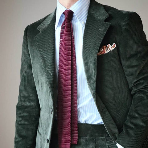
The shirt’s discreet stripes provide just enough contrast to the solid tie which ensures the ensemble remains harmonious. Similarly, the following image of mine in which I’m wearing a burgundy button down shirt and silk ottoman tie works because in addition to pattern, the ottoman silk provides a striking texture. It’s much easier to pull off colour-matching when incorporating garments of an entirely different texture, such as a cashmere quarter-zip pullover, or a merino wool knitted jumper over a similar coloured shirt. Let’s touch more on patterns and textures now.


The combinations, even when limited, become vast: a houndstooth jacket, solid shirt, striped tie; a chalkstripe jacket, solid shirt, spotted tie; a solid jacket; striped shirt, spotted tie; and so on. Delving in a bit further, the width of the stripes and spots also dictate how subtle or bold you can go. Naturally, if you’re going for butcher stripes and large polka dots, you’re veering into dangerous territory. Stripes, in my personal opinion, should be narrow and soft when paired with a smart suit, and bolder when worn more casually. If you wish to go bold with a pattern whilst keeping a smarter feel, it can still work provided any combining pattern is very subtle.

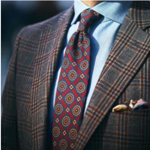
Now and then however, the right colours, patterns and textures combine for an incredibly playful ensemble, which for the right occasion, can work perfectly. The stark contrast of the soft red and white butcher stripes with the unusual zig-zag tie motif in green strangely works, partly down to the fact that the red is softer rather than a strong solid. To complete this look, I’d simply go for a cream trouser or even beige jeans, and a dark brown woven leather belt. As mentioned before, sometimes on paper things shouldn’t really work, but your eye will always help guide you.

Patterned jackets are always particularly interesting when it comes to picking your outfit for the day. If you’re going with a suit, the trousers will consist of the same pattern so it’s important not to overdo it. The stripe, or herringbone as another example, suit should be subtle and in an off-colour like charcoal rather than black; navy instead of royal blue and so forth.
If you’re going for a check option, a wider windowpane can often look quite good too, when in muted colours. Otherwise for checks, hounds and puppytooths, I’d actually break it up with a solid trouser to avoid things looking too busy. Quite often, the busier patterns and weaves are usually reserved for jacketing cloths only, so you shouldn’t find yourself having much issue in this department.
A jacket made specifically for a suit, shouldn’t ever really be worn separately primarily due to its lack of texture – something which I’ll touch upon shortly.

Texture is where we really get to have some fun, and out of the three, it is for me the most exciting. Whilst colour and pattern could be considered more of a science, texture is most certainly an art, and it also opens the world to you. Here, you get to incorporate everything from Japanese denims, English flannels, Egyptian cottons, Italian silks and Cuban seersuckers, to shantungs, waxes, cashmeres, bouclés, frescos, tweeds – all of which carry unique properties, washes, and weights. It’s kid-in-a-candy-store stuff.


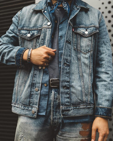
Speaking of denim, there aren’t too many that champion the fabric quite like our friend John Jarrett. Not only does he utilise it in his jeans and jackets, but he combines them in such a way that one can’t help but stand back and admire. Whilst adhering to the principles of colour-matching as discussed earlier, he uses the know-how from this and combines it with texture clashing through the other elements of his attire. Both of the looks shown below feature denims of various washes and weights, but through the accent colours of the hat, scarf, belt, boots and neckerchief, he’s retained a certain balance that makes the outfit work.

Overcoats and greatcoats are a perfect opportunity for tweed — one of my ultimate favourite cloths — to come into its own and help tackle all sorts of weather. Look to this fabric when you’re aiming to bring texture into your ensemble. Tweeds typically consist of multiple flecks of colour through the process of it being made, which means you can once again have a bit of a field day when looking for accent colours to complete the look.
Tweed is traditionally and typically quite a rough, heavyweight wool with an open weave, often developed as twills and herringbones. The finest quality tweeds are often sourced from the United Kingdom, and are found to be rugged, durable and great for absorption as they are created to tackle tough climates. Arguably the most famous, Harris Tweed, originates from the Isle of Harris in Scotland’s Outer Hebrides.
Whilst its primary usage was for high seas, shooting and hunting, it is developing and adapting to more casual jaunts through the countryside as well as occasional city wear. The lighter tweeds work best for the latter, and are often the most classic in design and colour.


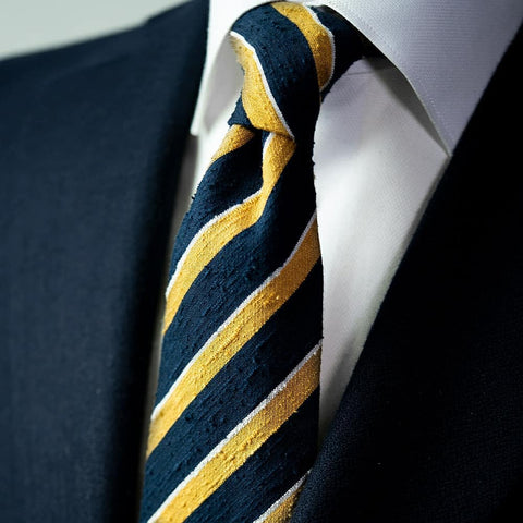
Once again, however, texture is often best implemented through the accessory. Swapping out a silk pocket square for a hand-rolled cotton iteration, or the printed tie for a silk knit or shantung allows for flair, and makes an outfit that much more interesting to observe. A seemingly classic outfit — navy suit, white shirt, and striped silk tie — can be elevated significantly by the simplest of substitutions: swapping printed silk for a shantung silk.
Shantung is a silk fabric with added texture created by the weaving of thicker yarns, which gives it a special handfeel and works for casual as well as smarter looks. Additionally, a knitted tie, as mentioned earlier, can provide a more obvious texture switch due to its significantly open weave and drape.
The thing with finding the right balance of colour, pattern and texture is that it isn’t something you suddenly solve overnight. It takes years of practise — 10,000 hours if you will. And as your understanding builds, so will your ability to combine these elements without a second thought. Eventually, when it becomes second nature, you can incorporate a sense of playfulness and push the boundaries.