Get Noticed with Flawless Jacket & Pocket Square Colour Combinations


There are some classic colour combinations when pairing your pocket square with your jacket colour that will always look immaculate. But why do some colour combinations look more harmonious than others? This is explained by colour theory, where particular colours are more complementary to each other and are therefore more pleasing on the eye. As an aside, colour theory is derived from the colour wheel that was devised by Sir Issac Newton in 1666, showing the relationships between colours.
The Colour Wheel

Utilising the colour wheel, there are some basic rules to follow that will ensure your outfit always looks harmonious. Below we've paired some of our pocket squares with some classic jacket colours to illustrate the theory.
See our video below which showcases some of our most vibrant prints and sartorial colours. You can view our full range here: Pocket Square Collection.
Complementary Colours
This is one of the simplest combinations, where any two colours on opposite sides of the colour wheel create a high contrast. Usually one colour forms the base, while its contrasting colour provides the accent.
Taking a classic navy jacket, any pocket square with a shade of yellow will always look striking. It's the direct contrast that really makes the magic happen.
The Palace Guard
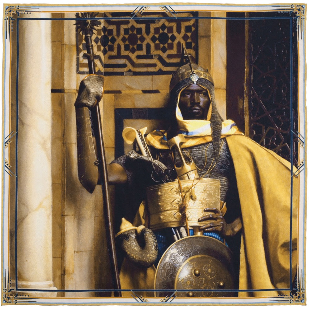

A variation that is also a classic combination with navy is burgundy/red/burnt orange as they are adjacent to yellow on the opposite side of the colour wheel, and also produce a high contrast that pairs beautifully with navy.
Mystical Bird


Monochromatic
A monochromatic look is possibly the most effortless style to pull off and is simply taking different shades of the same colour. It is more muted than wearing contrasting colours, but always looks stylish.
Long Live Victoria


Analogous
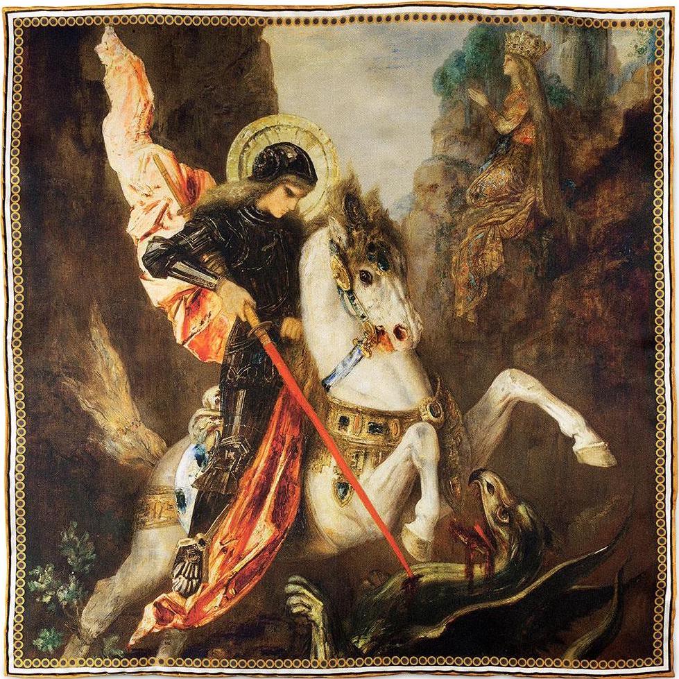
Colours that sit beside each other on the colour wheel form an analogous relationship. In the example below shades of reds, oranges and just a hint of yellow harmonise beautifully.
Saint George & The Dragon By Moreau

Black and Whites
You may be wondering why there are no blacks or whites on the colour wheel. That's because they're not technically colours and would sit at the centre of the wheel. Blacks provide shades when mixed with colours, while whites provide tints.
What this does mean is when you a pairing either a very dark or a very lightly coloured jacket you really are working with a blank canvas. A good rule of thumb is to choose brighter vibrant colours in summer and more muted, earthy colours in winter, but really it comes down to personal choice, you can't really go wrong!
The tuxedo below looks brilliant when paired with the red accent. For black tie events as long as you're wearing a black bow tie, you can really be bold with your colour choices.
The Death of Major Peirson


In a similar vein, the same applies for a lightly coloured jacket such as linen. Either darker colours that contrast directly such as the below, or brighter colours in summer always look stunning. The accent colour will always pop off the neutral jacket.
Saint George and the Dragon


Conclusion
We hope that, that gives you a brief overview of how you can apply colour theory to your outfit combinations. If you have any questions about outfit colour choices, please don't hesitate to get in touch and we'll be happy to help out: info@rampleyandco.com.
If you'd like to put your new found knowledge to the test, you can view our jackets and pocket squares here: Rampley & Co Store.