How to Style a Patterned Tie
Pattern is where a tie collection stops being a wardrobe utility and starts becoming a point of view. Stripe, spot, paisley, check, medallion: each has its own grammar, its own occasion, its own way of reading against a jacket and shirt. This is a complete guide to styling all of them.
Shop the Video
 Light-Grey Hopsack Wool Blend Jacket
 Heathered Oxblood & Ivory Stripe Silk Blend Tie
£155
Heathered Oxblood & Ivory Stripe Silk Blend Tie
£155
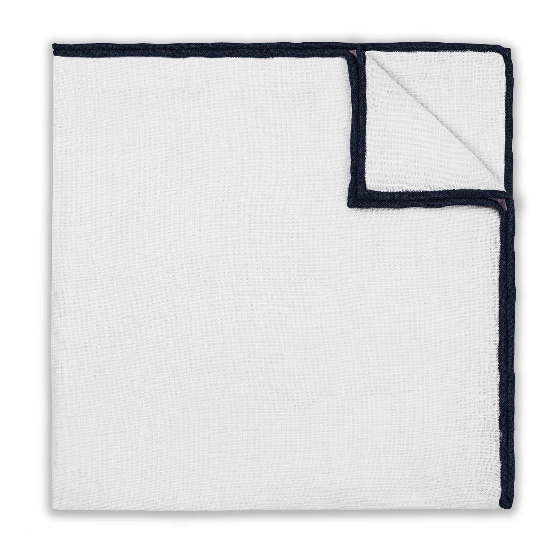
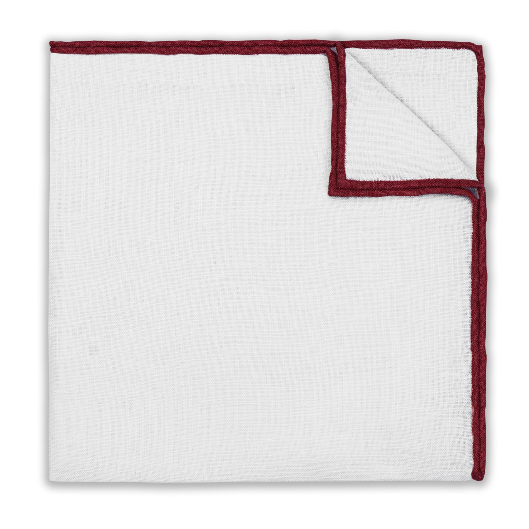 White & Burgundy Contrast Trim Linen Pocket Square
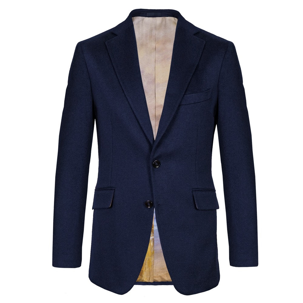 Navy Cashmere Jacket
 Copper & Oxford Blue Stripe Silk Tie
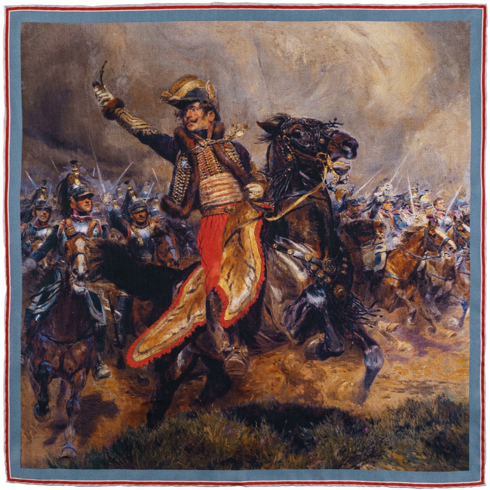 General Antoine-Charles-Louis Lasalle Pocket Square
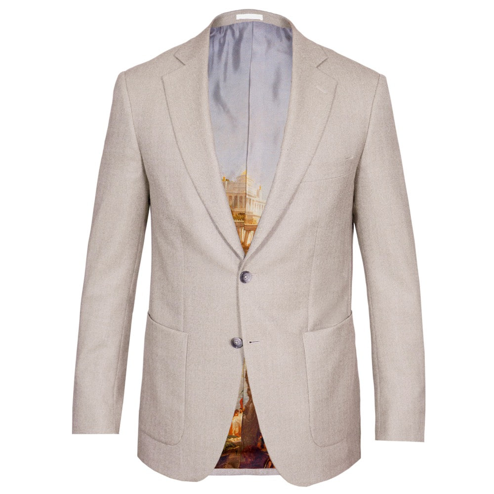 Biscuit Herringbone Wool Jacket
 Midnight Blue, Chestnut & Ivory Paisley Silk Tie
 White & Navy Contrast Trim Linen Pocket Square
 Light Grey Superfine Wool Jacket
 Burgundy Medallion Cotton-Cashmere Blend Tie
 Burgundy & Light Grey Contrast-Trim Silk Pocket Square
 Dark-Brown Hopsack Wool Blend Jacket
 Navy & Pearl Diamond Silk Twill Tie
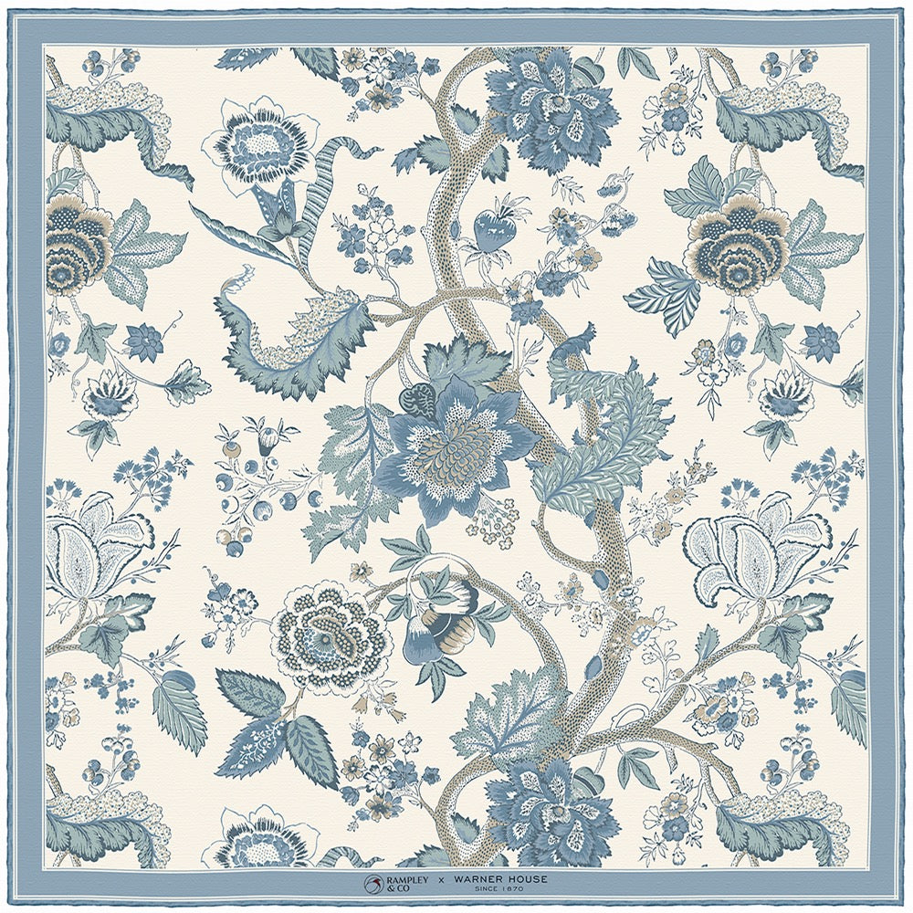 Palampore, Aqua Pocket Square
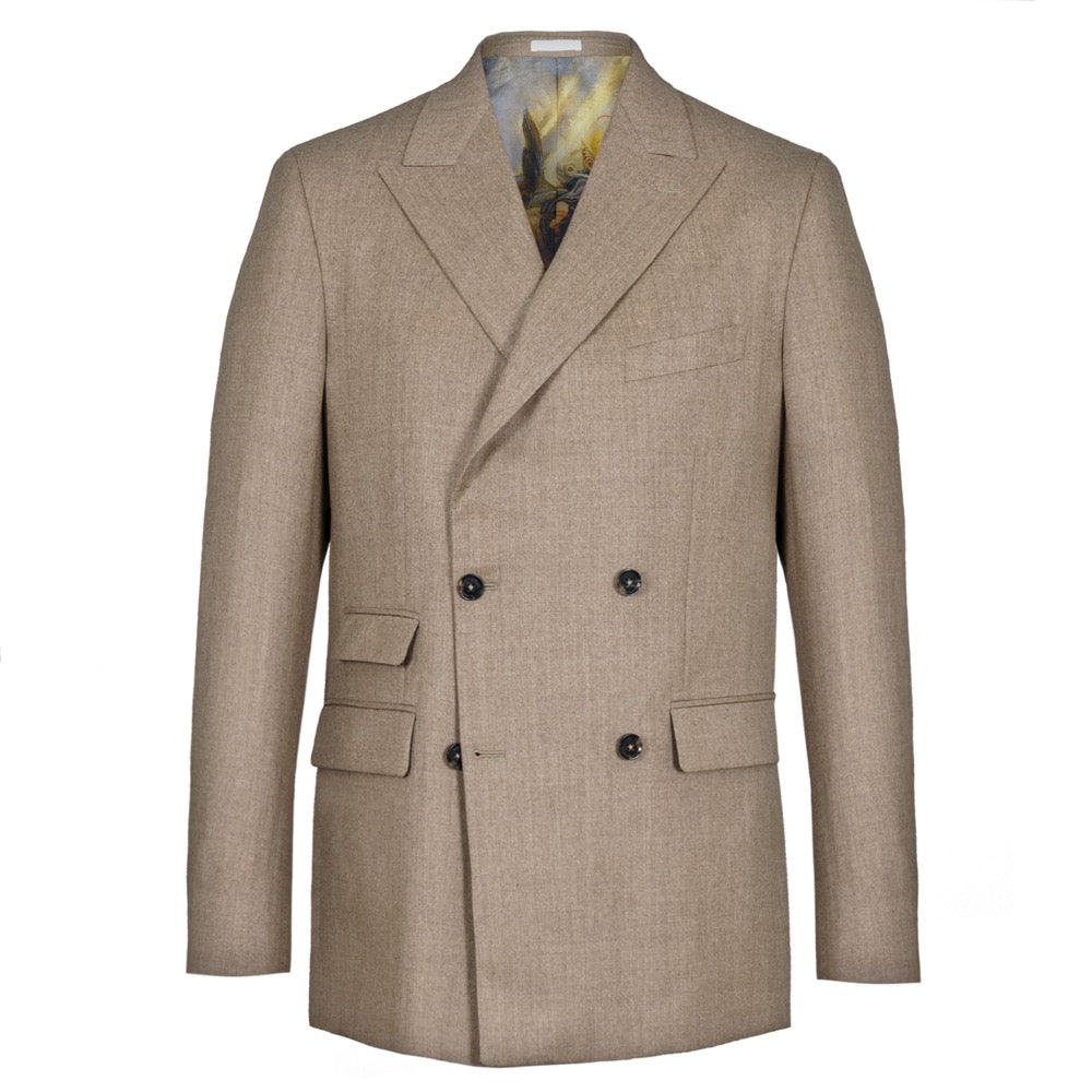 Beige Double-Breasted Jacket
 Gold & Red Micro Dot Silk Tie
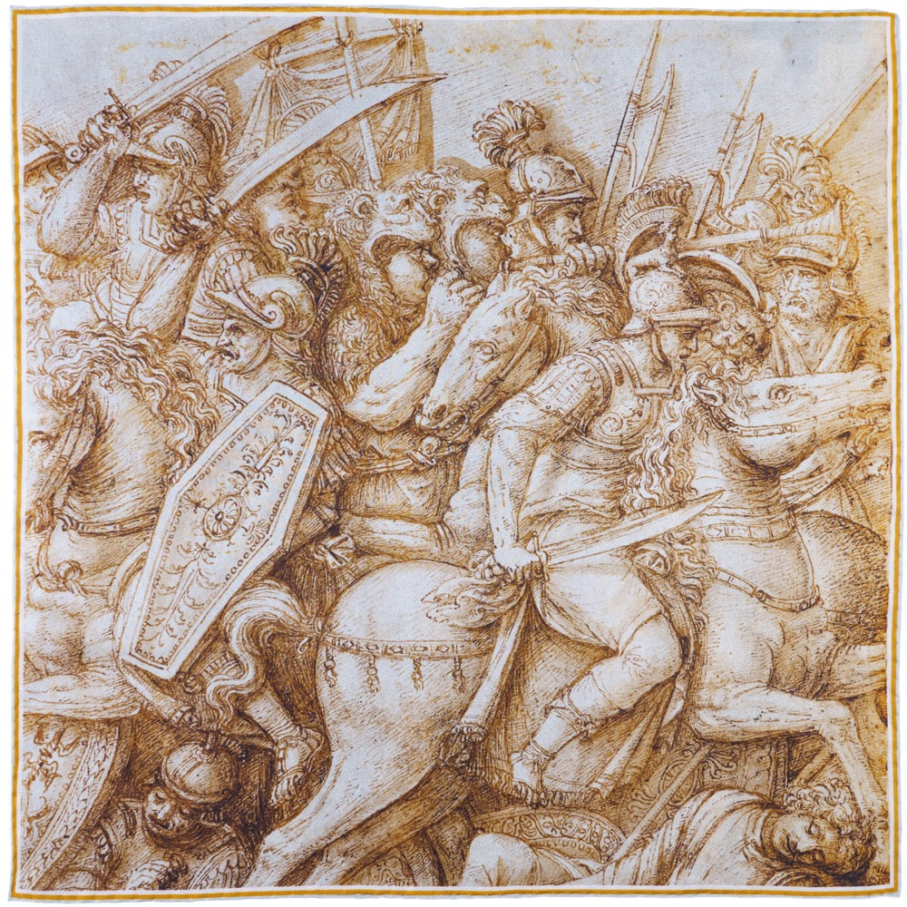 Trajanic Battle Pocket Square
 Dark-Blue Hopsack Wool Jacket
 Blue Geometric Silk Pocket Square
 Light-Blue Hopsack Wool-Linen Jacket
For more styling tutorials, subscribe to our channel
Subscribe to Our ChannelThe Enduring Case
Why a Patterned Tie Reveals More About How You Dress Than Almost Anything Else
A plain tie is a reasonable choice. It coordinates without effort, sits quietly in the composition, and asks nothing of the person wearing it. A patterned tie has an opinion. It interacts with the shirt, argues gently with the jacket, and requires you to make a decision rather than simply reaching for the nearest option. That process of deciding is, in the end, what separates someone who wears clothes from someone who dresses.
Stripe, spot, paisley, check, medallion and repeat: the patterns available to a tie are fewer than you might expect, yet each behaves differently and suits different situations. Together they cover most occasions a wardrobe will ever face, from the conservative business environment where the tie does its job without drawing attention, to the summer wedding on the continent where the point is to be noticed and enjoyed. Understanding the grammar of each is how you move from picking a tie that technically works to picking one that is genuinely right.
Texture deserves a place in this conversation too. A shantung silk or a woven cashmere contributes to the visual composition of an outfit in exactly the way a printed pattern does, without the explicit geometry. This matters particularly when the jacket is already doing a great deal of work. Understanding that distinction, between pattern as print and pattern as surface interest, is where the more considered end of tie dressing begins.
Stripe Ties
How to Wear a Stripe Tie Without Looking Like You Borrowed It From a School Outfitter
The stripe tie is the foundational patterned tie. No collection is complete without at least one, and most wardrobes contain several before their owner has quite noticed it happening. The design's longevity comes from its directness: it reads clearly at a distance, coordinates readily with solid shirts and plain jackets, and covers a wide span of occasions from a conservative boardroom to a summer wedding depending entirely on the colours involved and the weight of the cloth.
The common mistake is to treat all stripe ties as interchangeable. They are not. A bold regimental stripe in navy and burgundy on a flat silk, worn with a pale blue shirt and a navy suit, is the epitome of conservative professional dress. Replace the flat silk with a heathered or textured weave and alter the colours toward copper and oxblood, and the same design reads as far more contemporary and relaxed. The stripe is identical in structure; the mood is entirely different. Texture is the variable that moves the stripe from the boardroom toward a celebration.
For those who want a stripe tie to look considered rather than merely correct, the choice of shirt matters more than most people realise. Pale blue works, white works, both are perfectly sound. A fine small-scale check shirt under a bold striped tie is what a confident dresser reaches for. The scales interact: the smallness of the check sets off the boldness of the stripe, the two patterns amplify each other without competing, and the overall effect signals someone who has thought. Add a pocket square in a contrasting design that echoes one colour from the tie and the composition has genuine depth.


Spot Ties
How to Wear a Spot Tie: The Entry Point for Pattern Mixing
The spot tie is the most forgiving introduction to patterned dressing. Its geometry is regular and unthreatening, it scales well against almost any jacket check or shirt stripe, and it brings a note of personality to a conservative outfit without tipping into anything that requires explanation. In a dark, muted colourway on a flat silk, a spot tie is simply excellent business dressing. A mid-grey suit, a subtle check shirt, a discrete spot in a colour that echoes one element below the waist: this is how a boardroom dresser who pays attention to clothes actually looks.
The scale of the spot matters. Smaller spots read as more conservative and more permanent; larger spots move toward the festive and the occasional. The former works daily; the latter earns its place at events. For summer and occasion dressing, move into warmer amber, copper and orange tones and the spot tie changes character entirely. It becomes lighter, more festive, and pairs naturally with a chambray or soft linen shirt and a light jacket in natural tones.
A pocket square that shows the hand-rolled edge, folded outward so the contrast trim is visible, completes an outfit that reads as modern, warm and well considered. The shoes at that point should be brown suede loafers. A limited colour palette with different textures and patterns interacting is more interesting than a wider palette with everything in the same register: the eye has more to do, and the result looks more considered for it. The spot tie earns its place here precisely because it provides pattern without demanding that you already know what to do with it.

Paisley Ties
How to Wear a Paisley Tie Without It Looking Dated
Paisley has a reputation problem that it does not entirely deserve. The design itself is ancient, drawn from Persian and Indian textile traditions and refined over centuries into one of the most distinctive and versatile repeat patterns in woven cloth. Its problem in its cheaper incarnations is one of execution rather than concept: loud colourways, heavy outlines, inferior printing. Find a well-made paisley in good colours and you have something genuinely beautiful.
The contemporary way to wear paisley is to allow it to be subtle. A tonal tie, where the paisleys are woven or printed in colours close to the background, reads as textural rather than explicit. Against a linen jacket in a complementary tone, with a plain linen pocket square for contrast and a natural linen shirt, the overall effect is quietly Italian in a way that does not feel like a costume. The tie is doing its work without announcing itself. Trousers in slim-cut chinos, loafers, a dark sock that picks out one accent colour from the pocket square: this is a complete outfit for a warm-weather occasion on the continent.
The bolder version of the paisley tie, with a larger design and more visible pattern, calls for restraint elsewhere. A fine check shirt rather than a solid, because the interaction of two different scales is far more interesting than either alone. Keep the jacket plain. A pocket square in linen that shows its contrast-trim edge adds texture and refinement simultaneously. The overall effect is serious without being conservative, which is a more useful distinction than corporate versus casual.


Plain Ties and Texture
Why a Textured Plain Tie Is Sometimes the Most Sophisticated Pattern of All
A well-chosen plain tie in a quality cloth is the most versatile item in a tie wardrobe. It coordinates without effort, works across jackets and shirts of every weight and occasion, and asks relatively little of the person wearing it. All of that is true, and it still misses the point. The quality of the plain tie depends almost entirely on the quality of its texture, and this is where the conversation about pattern and plain begins to overlap.
A cashmere tie with a soft light-reflecting weave, a shantung silk with the natural slub of the raw thread visible in the weave, a silk-linen blend whose surface catches light differently from different angles: none of these carry a printed pattern, yet all behave as pattern does in a composition. They give depth. They create interest. They allow the jacket to carry more pattern than it otherwise could, because the tie contributes texture rather than competing with another geometric design.
This is particularly useful when the jacket in question is one that wants to be noticed. A florally patterned or boldly checked sports jacket often needs a plain tie to settle the composition. A flat, matte plain tie reads as an absence rather than a choice. A cashmere or shantung plain tie reads as a considered decision. The jacket does the talking; the tie holds its ground without arguing back. The pocket square in that context can be bolder, and the overall effect is polished rather than over-decorated.

Medallion and Repeat Ties
How to Wear a Medallion or Repeat Pattern Tie in the Modern Wardrobe
Repeat pattern ties cover a wide territory: any design that tiles across the cloth in a regular arrangement, excluding stripes and spots. That includes medallions, small geometric repeats, floral repeats and a collection of older designs currently enjoying a revival among those who dress with genuine attention. These patterns carry a sense of history and connoisseurship that simpler designs do not, and in updated colourways they read as genuinely contemporary rather than merely old-fashioned.
The medallion is a core example. Popular in classic menswear tailoring of the mid-twentieth century, it fell out of fashion and is returning now in a more restrained, textural form. A burgundy medallion in a cotton-cashmere blend reads as smart-casual in the right context: a sports jacket rather than a suit, dark navy trousers, a pink or warm-toned shirt that picks up one shade from the motif, and a pocket square in a paler tone that echoes both the jacket and the tie.
The tobacco or olive-background medallion, paired with a plaid or overcheck jacket where the background colour echoes the tie, is one of the more sophisticated combinations available to a patterned dresser. Multiple patterns interact simultaneously: the check in the jacket, the repeat in the tie, the design of the pocket square. The key is that one element, usually the pocket square, draws the colours together rather than introducing something entirely new. Plain mid-tone trousers and brown shoes settle the whole composition below the waist.
Check and Fine-Pattern Ties
Why Fine Check Ties Belong in Every Serious Tie Wardrobe
Among all the pattern options available to a tie, the fine check is possibly the most underappreciated and the most rewarding. Houndstooth, Glen check, shepherd's check, diamond check, puppytooth: designs with deep roots in British and Scottish textile tradition, refined through the first half of the twentieth century into something that reads simultaneously as old-world and contemporary. There is a reason a well-dressed man from the 1930s would look entirely at home in a fine-check tie today. The design has never been wrong, merely temporarily unfashionable in certain circles.
The fine check tie works through contrast of scale. The pattern itself is small, precise, and geometric. Against a bolder-check or plaid jacket, it echoes the check idiom of the jacket without competing with it; against a plain jacket, it introduces a note of texture and interest that a simple stripe or spot does not quite manage. Worn with a puppy-tooth striped shirt under a double-breasted jacket, the fine check tie belongs to a broader aesthetic of considered pattern-on-pattern dressing that suggests ease and confidence without trying to announce either.
For summer occasion dressing, a puppytooth tie in bordeaux and pearl pairs naturally with a jacket in the same warm-red family. The bordeaux in the tie and the rust in a check jacket occupy the same colour temperature without matching, which is the more interesting relationship. Plain trousers and brown shoes below the waist resolve the composition cleanly.


The Rules of Pattern Mixing
How to Mix Patterns in a Tie Outfit Without It Going Wrong
Pattern mixing has a worse reputation than it deserves. The first principle, and the one that resolves most problems, is scale. Two patterns of the same size placed next to each other compete for attention and produce visual noise. Two patterns of different sizes interact productively and create depth. A fine-check shirt under a bold-striped tie works for exactly this reason. The same shirt under a fine-spot tie produces two small patterns fighting at close quarters, which is why it rarely does.
The second principle is colour. A maximum of three colours across the entire outfit, excluding neutrals, is the standard working limit for most dressed occasions. This does not mean the outfit cannot be varied and interesting; it means the variation happens through pattern, texture and scale rather than through the introduction of additional colours. A navy, burgundy and cream palette distributed across a jacket, tie, shirt and pocket square in four different patterns is a sophisticated, layered composition. Add a fifth colour and it begins to look assembled rather than considered.
The third is the role of the pocket square. In a heavily patterned outfit, the pocket square functions as either a resolution or a contrast. A pocket square whose colour echoes the dominant tone of the tie draws the composition together; one in a completely different design from any other element adds a final note of individuality. Both are correct approaches. What does not work is a pocket square that matches the tie too closely, which produces the over-coordinated look of a gift set. Browse the pocket square collection with those principles in mind and the right choice becomes considerably easier.
Occasion by Pattern
Which Patterned Tie Works Best for Which Occasion
The question of which pattern to reach for is partly about taste and partly about occasion, and the two are not always the same thing. A tie that expresses your personality may be entirely wrong for the room you are about to walk into, and a tie that is right for the room may be one you find slightly dull. The goal, in most cases, is to find the overlap between the two.
For traditional business environments, where the dress code is conservative and the stakes of getting it wrong are real, the stripe in dark colours on a quality silk is the most reliable choice. The spot in a muted colourway runs it close. Either will read as professional and considered without attracting attention to themselves, which is usually the point. A fine check shirt adds a layer of interest without risk.
For smart-casual occasions, interviews in creative industries, business dinners, events that require a jacket but not a suit, the repeat pattern comes into its own. Medallion, geometric and diamond-check ties all read as deliberate and tasteful, especially against a sports jacket with some pattern of its own. The paisley in a tonal colourway works here too, particularly in the warmer months.
For weddings and celebrations, the full edit opens up. Colour becomes an asset rather than a risk. Textured stripe ties in warm tones, paisley in livelier colourways, spots in summer shades: all are more interesting than reaching for the safe navy stripe that will be on half the lapels in the room. The Wedding Edit is a useful starting point for anyone dressing for a specific event.
More From the Tie Collection


Frequently Asked Questions
Your Questions Answered
What is the easiest patterned tie to start with?
The spot tie in a small scale and conservative colourway is the most forgiving introduction to patterned dressing. It coordinates readily with solid and striped shirts, works against most jacket patterns without competing, and introduces personality without demanding pattern-mixing confidence. Once comfortable with a small spot, the natural progression is toward stripes in textured fabrics, then fine checks, then medallions and paisleys as taste and confidence develop.
Can you wear a patterned tie with a patterned shirt?
Yes, and doing it well is one of the stronger signals of a confident dresser. The principle is scale contrast: the patterns must differ in size. A bold striped tie with a fine check shirt, or a large paisley with a small-scale check, works because the eye reads the two patterns as distinct rather than as noise. Two patterns of the same scale placed adjacent to each other compete and confuse. Keep one pattern dominant and one subordinate and the composition holds together well.
How do you choose a pocket square to go with a patterned tie?
The pocket square and tie should relate through colour rather than through matching pattern. Pick up one accent colour from the tie in the pocket square, but use a completely different design. A striped tie pairs well with a printed pocket square; a paisley tie pairs well with a plain or fine-texture linen square. The worst outcome is a matching tie and pocket square in the same print, which reads as a set rather than a wardrobe. The second-worst is a pocket square that introduces an entirely new colour unconnected to anything else in the outfit.
What patterned tie works best for a wedding?
For a wedding, colour becomes an asset and the full patterned tie collection is available. A textured stripe in warm copper or oxblood tones works particularly well in spring and autumn. A tonal paisley in a linen blend reads as elegantly continental for a summer occasion. Spot ties in amber, gold or warm seasonal colours are genuinely festive and easy to carry. Very dark, muted colourways read as office dressing in a room that is dressed for something else. The Wedding Edit is organised specifically with this occasion in mind.
Is a plain textured tie considered a patterned tie?
For practical styling purposes, yes. A shantung silk with visible natural slub, a cashmere tie with a soft directional weave, a silk-linen blend with surface irregularity: all contribute the same visual depth and interest that a printed pattern does, and all interact with the surrounding jacket and shirt in the same way. The absence of a printed design does not mean the absence of visual texture. A plain tie in a beautiful cloth is doing exactly the same work as a patterned one, just in a quieter key.
What jacket colours work best with patterned ties?
Navy and mid-grey are the most reliable foundations because they are neutral enough to accommodate tie colours and patterns of every kind without conflict. Brown and camel jackets work particularly well with warm-toned stripe and spot ties. A patterned jacket, a check, plaid or herringbone, asks for a plain or finely textured tie rather than a competing large-scale pattern. The more pattern the jacket carries, the simpler the tie should be, with texture rather than print providing the interest.
To explore the full patterned tie collection, click on the button below.